Infinity Nikki's New Update Sparks Backlash: Players Criticize Aggressive Gacha Prompts
Infinity Nikki's latest UI update disrupts its relaxing gameplay, sparking community frustration over aggressive gacha prompts.
Hey everyone, it's your average player here, and I need to talk about what's going on with Infinity Nikki lately. You know, that super cozy and relaxing dress-up game that felt like a breath of fresh air? Well, a recent update has thrown a bit of a wrench into the peaceful vibes for a lot of us. The game just hit some amazing pre-registration milestones and launched with so much promise, setting what felt like a new standard for free-to-play titles. I, like many others, have been happily playing without spending a single penny, enjoying the beautiful aesthetic and chill gameplay. But now, the latest changes to the user interface are making it feel less like a relaxing escape and more like a persistent sales pitch. It's a real shame because the core game is still fantastic. 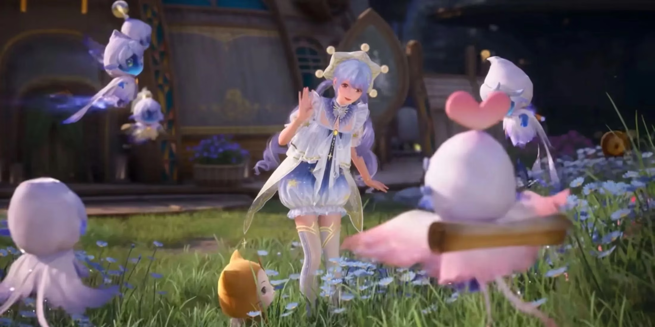
The crux of the issue is all in the UI. After the update, players logging in were greeted with new, flashy icons plastered right on the main interface. We're talking shopping cart symbols and other shortcuts that are hard to miss because they're directly tied to the game's gacha system—the Resonance system. And it's not just that they're there; it's how they're there. These new buttons don't just sit quietly. Oh no. They shimmer. They pop out with animations. It feels like they're physically reaching out of the screen, beckoning you to click on them. Seriously, the first time I saw it, I actually thought, "Oh cool, maybe there's a special sale or login reward!" Spoiler alert: there wasn't. It was just a very loud, very persistent reminder that the game really, really wants me to open my wallet. The contrast with the rest of the game's soft, dreamy aesthetic is jarring, to say the least.
This has sparked a major wave of frustration across the community. If you check out places like Reddit or the official forums, you'll see threads flooded with complaints. The sentiment is pretty unified: this change feels overly aggressive and disrespectful of player time.
-
For free players: Many of us chose Infinity Nikki specifically because it felt respectful. We could enjoy collecting outfits and exploring the beautiful world without constant pressure to pay. This update shatters that illusion. It creates a nagging feeling, like the game is tapping you on the shoulder every few minutes saying, "Hey, you sure you don't want to spend some money?" It turns a voluntary option into an obnoxious obligation.
-
For spenders: Even players who don't mind occasionally buying into the gacha system are annoyed! They don't need or want to be reminded. They'll spend when they choose to, not when a flashing icon demands it. The update treats everyone like they need to be funneled toward purchases, and it's just... exhausting.
Let's be real for a second—we all understand that Infinity Nikki is a free-to-play game. The developers at Papergames need to make money to keep the lights on and the updates coming. Nobody is naive about that. Gacha mechanics are a common, if controversial, way to do it. The problem isn't the existence of monetization; it's the execution. The previous balance felt fair. The new approach feels desperate and intrusive, like one of the worst elements of mobile gaming has been cranked up to eleven.
What makes this situation particularly worrying is the timing. Infinity Nikki launched with such incredible goodwill. Fans were championing it as a potential new model for F2P games. To see this kind of controversy erupt so soon after release is a massive red flag. We've seen this story before in 2024 and 2025 with other live-service hits. A game builds a passionate community, then a tone-deaf update or monetization shift damages its reputation and drives players away. It would be heartbreaking to see Infinity Nikki follow that same downward spiral over something as fixable as UI clutter.
The community isn't just grumbling. Players are actively trying to send a message to Papergames. People are flooding the official customer service channels with feedback. Some clever players have even been using a developer survey link—originally meant for feedback on controller and console support—to voice their strong opinions about these UI changes. It's a collective effort to say, "We love your game, but this isn't okay. Please listen to us."
So, where do we go from here? The hope, shared by probably thousands of players right now, is that Papergames will acknowledge the feedback. The best-case scenario would be an apology and a rollback of these specific UI changes. Maybe they could move the more prominent shop icons to a less intrusive menu, or at the very least, turn off the aggressive animations. The old, subtler approach was working just fine. We're all waiting for a response, hoping the developers understand that preserving the game's cozy, player-respecting atmosphere is what will keep it successful in the long run, not flashy buy-me buttons. For now, we keep enjoying the beautiful meadows and fantastic outfits, but with a slightly more wary eye on the corners of our screens.